Are you part of the clique?
How’s that working for you?
First column represents how many picked that player.
Second column represents how they’re doing (point wise)
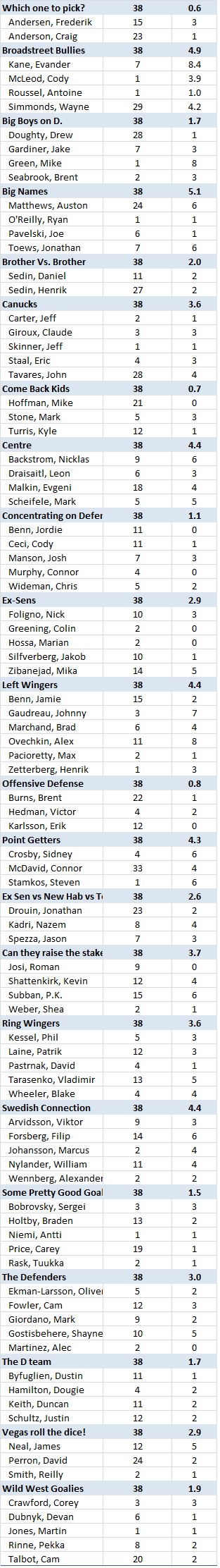
Enjoy!
Are you part of the clique?
How’s that working for you?
First column represents how many picked that player.
Second column represents how they’re doing (point wise)
Enjoy!
Happy Thanksgiving, Everyone! We’re back – bigger and better than last year.
This year, we’re using a new pool provider, have more teams (38), some new scoring, and some new (and wackier) box selections. Each participant has picked 22 players.
To get everyone started, here’s a look at how similar the teams are:

First thing – it looks like we’re all snowflakes. Nobody has picked the same team as another. That said, the following teams are the most similar:
Likewise, there are no two teams that are completely different. The closest we get to having unique teams is between Wayne’s World and IHitRandom, who only have one common selection.
Until trading starts, I’d recommend finding the individual whose team is most common to yours – that’s your competition. Trash talk them to your heart’s content.
Looking forward to a great season. Stay tuned for more.
OSB
He’s back! And early, too:
He's baaaack: Flames star winger Gaudreau returns vs. Ducks
Finger surgery was expected to keep Johnny Gaudreau off of the ice until after Christmas. However, favorable post-surgery rehabbing allowed for a return last night for Calgary’s win over Anaheim.
The F9 category will be a little more interesting at this point, as the injury had caused DG, KS, PB, and WS to drop ion favor of the group-leading Artemi Panarin. At the time of the injury, Gaudreau had 11 points. During Gaudreau’s injury, Panarin earned six points. From here, if Gaudreau is able to close that 6-point gap, that means that four players had made unnecessary trades. This would be great news for AMac, CG, ES, JC, RL, TL, and TS, who had opted to hold onto Gaudreau through the injury.
Additionally, Gaudreau’s return was not forecasted in yesterday’s predictions. Given his point history while on ice (approx 0.7 points scored per game on-ice), and the fact that he racked up two points last night, these participants can expect another (2+0.7*3)= 4.1 points on their total at the end of the week.
All of this notwithstanding those that picked either Panarin from the outset, or Pavelski are still best positioned to be leading in this group.
Next up, let’s see how long Golden boy Mark Scheifele stays injured.
Happy Sunday, everyone!
Here’s a look at the next seven days of NHL games:
Based on this information, I predict the following happening:
Enjoy!
The first week-long forecast has wrapped, here’s a review of how it went. The forecast was overly optimistic, as most players under-performed the forecast (represented by the negative values). There were, however, a few notable exceptions: Continue reading
I’ve finally gotten around to laying out a 7-day forecast, per the below: Continue reading
Trading season starts tomorrow. And with trading season, comes new opportunity!
Should you dump every poor performer now, have faith in your picks, or trade gradually?
Before you start trading, you may wish to see where the actual opportunities are. According to the pool rules, players can only be traded for another player within their specific grouping. So, just because you have a player that’s doing poorly, doesn’t mean that trading them out will get you much further ahead.Trading effectively has everything to do with dropping the players that are keeping you the furthest behind.
Perhaps a box and whisker plot can help you in making those decisions!
In the plot linked below, the performance of every player in every group is laid out.
https://public.tableau.com/shared/DQB57MR3M
A couple of things to note about this graph:
In case you’re unfamiliar with box and whisker plots, here’s a quick explanation, . The below is based on blood pressure:
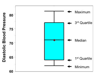
These plots are useful for a couple of reasons:
Hope this helps to steer your decisions – enjoy the trading season everyone!
PS – the table will be updated automatically on a semi-regular basis.
PPS – to see the same information in tabular form, including ‘who picked who’, this table lays it out: https://public.tableau.com/views/PerformanceHistory_0/GroupingBreakdown
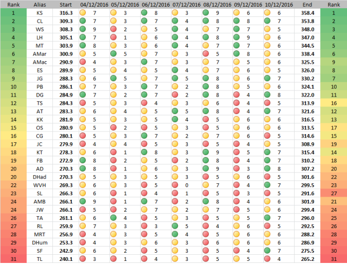
Part of the reason I started this blog was to wean myself off of using Excel for most of my analysis and presentation of information. At this point, I’ve gotten away from it almost entirely for presenting information, save for removing the names of our pool participants from all data in the public domain. Now, the daily data is dumped into a Google Sheet (still a spreadsheet, I know!), and Tableau now updates automatically.
Tableau’s interface is really starting to grow on me. From the limited exposure I’ve had so far, setting up visuals is super intuitive and easy. For instance, the information I had been presenting previously (performance by player and grouping) can now be rolled back over time, and red markers indicate player injuries.
Geeks like me get excited about this, because I can now see things like exactly how quickly Crosby will catch up with the pack since returning from his concussion.
The interactive table can be found here:
https://public.tableau.com/views/PerformanceHistory_0/PerformanceHistory
Next up, transition from spreadsheet to database, and build in forecasting!
Stay tuned.
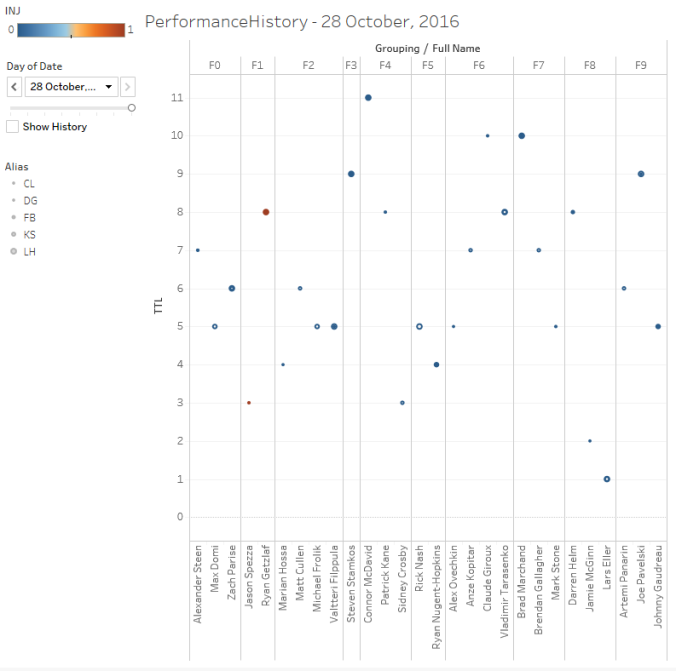
The more I use Tableau, the more I like it. Below is a breakdown of the performance of every forward in the (currently-ranked) top three teams:
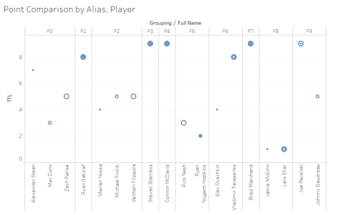
In this case, the smallest dot is CL, medium-sized is KS, and the largest is LH. It’s pretty easy to see that all three participants have four players in common, and in total there are only two groupings where all three have unique selections – a good thing to know!
The best part is that the graph is fully interactive, and can be altered to compare any grouping between any two (or more) participants. The interactive chart can be found here:
https://public.tableau.com/views/PointCompare26Oct2016/Compare
Once I find a way to update the data automatically, this can become more of a dashboard than a static chart. Enjoy!
Well, here we are again. Last night was a big night for some, and not so big for others. RL and SL scored the most points, and the forecast only really blew it on three participants (over 100% error for JG, AT, and JW, all who under-performed). Here’s a summary: Continue reading
